Mapping the Benefits of a College Degree
By Emily Rogan
September 26, 2014
Interactive tool helps students and families compare the long-term value of a higher education.
As the price of higher education continues to skyrocket, administrators spend a lot of time encouraging students and families to take the long view.
While a college education is going to cost families — even the cost of community college tuition is on the rise — the real benefit of a college degree is reaped down the road, in future earnings potential.
The argument is familiar. A student who graduates high school and enters the workforce might expect to make $30,000 a year, assuming those wages will increase and eventually plateau over time. Whereas a student who enrolls in college full-time after high school will likely take on some amount of debt before emerging with a degree and an opportunity to earn more than the typical high school graduate over the length of their career.
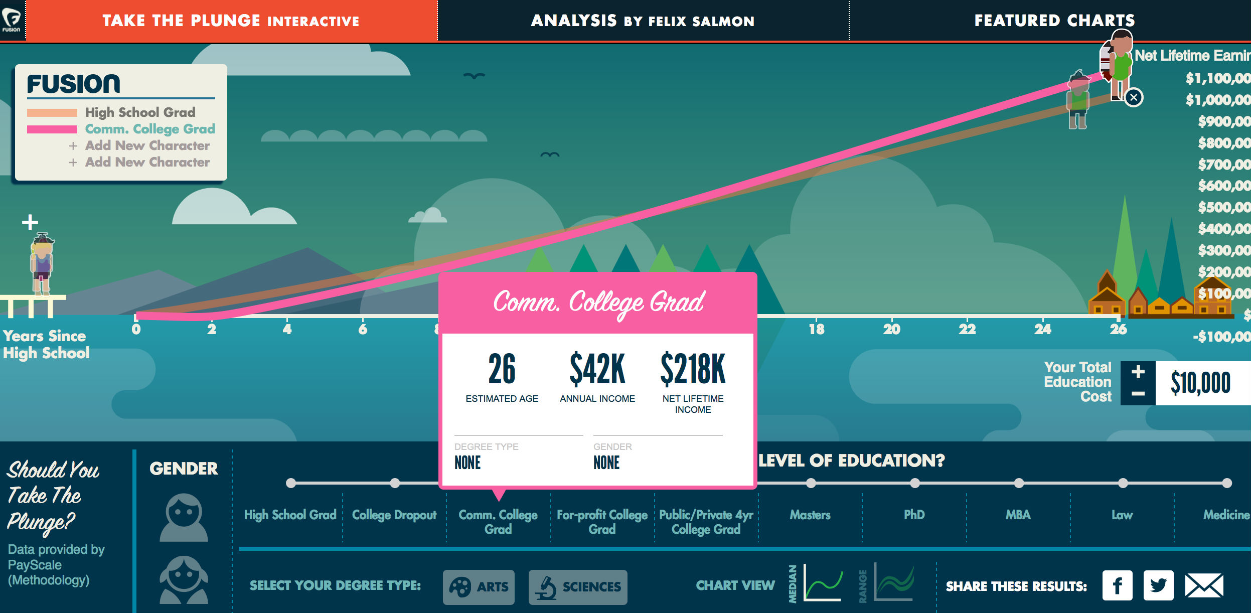
But getting students and families to visualize the long-term benefits of a college degree against the short-term promise of 30-grand out of high school is sometimes easier said than done. In attempt to make these comparisons easier, researcher Felix Salmon recently created Take the Plunge on the Fusion network. The interactive charting tool uses survey data from online salary tracker PayScale to chart the average salaries of responding high school and college graduates over time, complete with a rough estimate of net income over the course of their careers.

The findings come with their share of caveats. For instance, Salmon says his tool isn’t intended to accurately predict individual earnings; instead it takes into consideration millions of survey results from across the country to form a broad overview of others’ experiences in the job market.
Users are asked to select from a combination of criteria, including type of degree (sciences or arts), highest level of education and gender. Based on those selections one or more animated characters ascend up the chart, ultimately landing at the point that indicates net lifetime earnings in years since high school completion. Users can click any spot along the career trajectory for an average salary at that point.
A series of featured charts illustrate some of the most telling trends, including how college graduates eventually out earn high school graduates, the difference in long-term career earnings between men and women, and the relatively low earnings potential of college degrees in the arts.
Have a few minutes? Give Salmon’s interactive tool a try. Better yet, have your career advisers and K-12 education partners share it with students.


